Lecture
Week Four
~~~
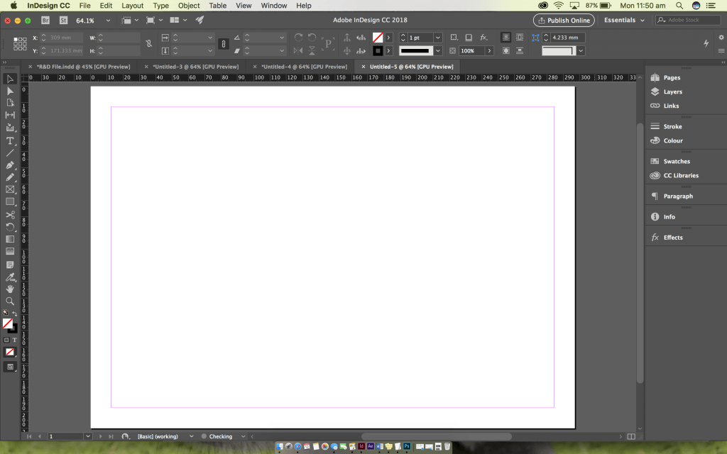
During the lecture in week four, we learnt about grid systems and creating personas. Below are the screenshots of what we did and a simple following of my understanding.

If I was to create a persona, I would more than likely lay the page out like this, this would allow me to space texts and images out clearly and efficiently. I will use inDesign to create this document.
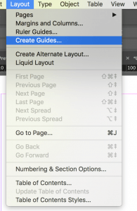
To achieve a spacious layout, I will need to go to the layout drop down bar and select Create Guides…
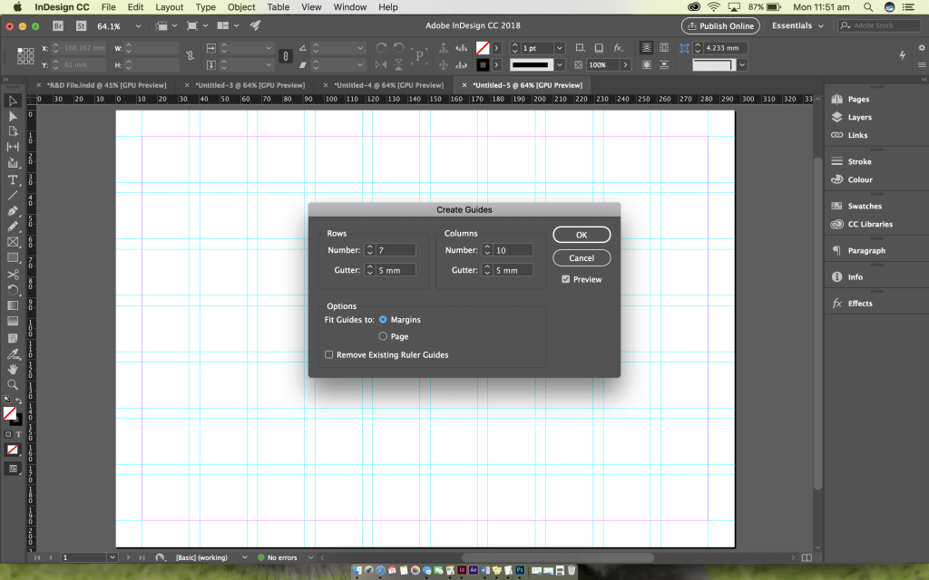
Following the drop down bar, it comes up with a box that allows you to set the setting in which you prefer and need. I will need seven rows and ten columns, I need to make sure I select the ‘Fit Guides to’ margins and NOT page. This measures everything up with the pink box and makes sure there is no bleed when exporting, it also makes it look neater.
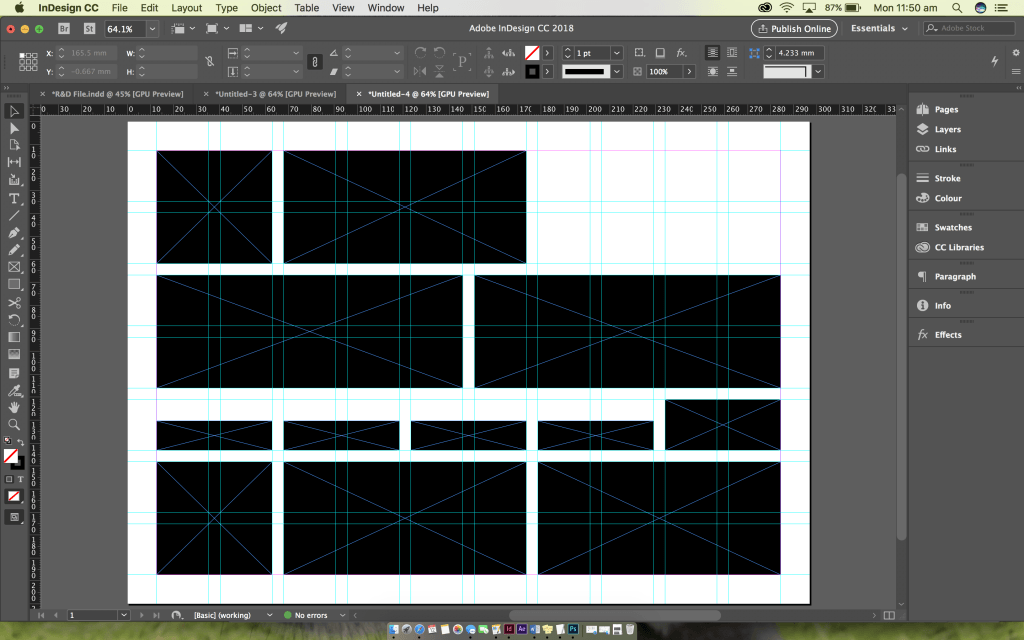
If I add blacked out boxes I can see automatically how neat it looks. Not to mention, now that it is completed I can use this as a template in the future.
Below is the PDF of the above demonstration for an efficient grid system, as show in the lecture.
Grid Systems – Hope Thompson (Demo)


