Project Name


In terms of creating a name for my project, I needed to consider the logistics. I am not creating an app or a game, therefore, the name really does not need to be catchy or trendy. Due to my final solution being a lesson plan, the name needs to be formal, as if it is an elegant but a formative company/trust. The name needed to be easy to remember and easy to pronounce, I wanted something that was short with an underlying meaning. I thought about using the name of someone close to me, because this would create meaning and it is quite often used. Just recently, the Prime Minister (Theresa May) named a new law after a young child named Max, naming it ‘Max’s Law’. This was after he created an organ campaign to save lots of peoples lives, including his own. This new law states that you are automatically enrolled in being an organ donor unless you opt out. (https://www.mirror.co.uk/news/politics/donor-law-called-maxs-law-11327971)
Moreover, I decided to call this project The ADAM Primitive Project. Below is a guide as to what ADAM means.
A – Auxilim (Aid) – Latin
[in]
D – Disreputable
A – Assisted
M – Medicine
The reason I chose the words, aid in disreputable assisted medicine, is in relation to some people not knowing first aid. Which in turn makes it disreputable and distrustful. It makes most things a lot more dangerous and it is a problem that can be solved by a new learning programme introduced into schools.
The ‘Primitive’ word relates to denoting the early states of something in development, I felt this was fitting because it matches the problem. This problem is in the process of being looked at but in an undeveloped and rough manner. As this word has two meaning, I felt it fitted rather nicely.
The word ‘Project’ is used at the end because it is not a product, it is a project. Something that would be proposed to the government or people who work in schools, it is something that could be developed after several case studies have been conducted.
The colours I had the choice of were; Yellow, Orange, Blue, Green or Red. Yellow and orange are not very nice colours, I find them unattractive and hard to use when trying to attract peoples attention. In terms of branding, I think they look very childlike. This would not work for the audience I am trying to reach. Blue is used too much and does not really attract the right attention. Green is used on everything; emergency escapes, first aid, no danger, some hospital uniforms etc. however, I did not want to use the conventional green colour in cooperated into my logo, although it is fitting, it still does not attract the right attention. It is eye catchy and it is insinuated in emergencies, the old-fashioned medical cross used to be red also.
Logo Design
I had to really negotiate with myself about what type of logo I needed to produce, I wanted to do something that is conventional but original. I experimented with several ideas, but I ended up going for a more simplistic approach. Below are a few drawings I did before I mocked up a few examples. 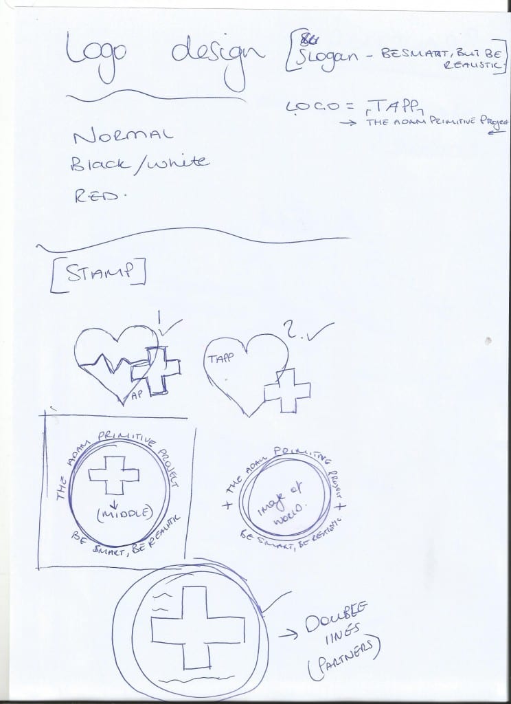
![]()
![]()
As you can see, I am not very good at utilising hard drawn logos. I do not feel like this is where my creativity lies.
![]()
![]()
These two I really like because they are simple and elegant, however, I really feel like it needs some sort or words. Not to mention, it does look like some logos that are already out there.
![]()
This one is good, but it is not really interesting enough for me to apply to all my documents.
![]()
This last logo is my favourite. it is hard to read at first but I think it would work as a little water stamp or a logo print etc. I think is the final logo I will have as part of my finished piece.
Lesson Plan Thumbnails
I have drawn up some lesson plan thumbnails, this is a rough guide as to how I want my lesson plan to play out. The final product will be attached to my crowdfunding page.
