Crowdfunding Visualisation Assets

Visuals for Crowdfunding

For my crowdfunding page, I wanted to create a little ad campaign using two different software applications. However, I could not get Adobe Dimension to render my image out properly, I tried more than three times. I even tried rendering it in a different format, but in the end, I just gave up. Therefore, I continued to use photoshop to conduct my advertisements. I wanted to showcase only the advertising aspect because my lesson plan proposal is what’s really important. The crowdfunding page is not only aimed at an audience who want to donate, but it is also aimed at government officials and leaders/people who work in schools. They are the ones who are going to have to let me into their schools to conduct the case studies.

Here are the examples of Dimension, I ended screenshotting what I wanted to render out. I will not include this in my Research and Development file.

UntitledScreen Shot 2018-03-05 at 23.07.49

I created some business cards, to hand out physically. This way people will have the contact information within their very pockets.

BusinessCards


As part of the advertising campaign and to make the public aware of the programme I am trying to make, I have drawn up some examples from which the posters and adverts will take place. With the posters being placed in broad daylight, people might pay attention. Not to mention, because the posters do not have much information on them, people are more likely to read them. I know when I look at a poster, I sometimes only read the title to see what it is about.

PosterFramePSDMockUp2 StreetBillboardPSDMockUp bw StreetBillboardPSDMockUp Watch

I have made some items that can be claimed for rewards for everyone who pledges. Alongside the crowdfunding page, I could sell the items to make extra profit for the programme. However, for now, these items will be given away every time someone backs the idea and pledges a certain amount. Every five pounds would get them a bag, and everything pledged above five pounds will receive a T-shirt of their choosing. The business card will also be sent out with the items, so they always have a way of contacting me. Possibly a thank you letter, as a common courtesy.

There is four T-Shirts to choose from and a single Tote bag design to help with all those shopping needs.

CanvasToteBagMockUp

Two black Designs and Two White Designs;


T-ShirtMock-UpFront boy

T-ShirtMock-UpFront stamp 2

T-ShirtMock-UpFront stamp

T-ShirtMock-UpFront

I mocked up a little thank you letter, that would be sent with the items. To view this letter just click the word letter and it will bring up a PDF.

Letter


Crowdfunding research

Crowdfunder
Kick-Starter


Before I can begin my crowdfunding page, I have to research into what it meant to produce a funding page and what the existing pages look like. This way I could visualise and produce a layout plan of what I expect my crowdfunding page to look like.

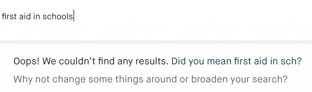
To begin, I opened up Kick-starter and straight away they give you a list of successful things to look at. Screen Shot 2018-03-06 at 13.16.02

I typed in my project, to see if anything came up, as I was interested to see what type of projects were out there and except for games or first aid products. There is nothing in the nature of what I am doing. Which for me, is a good thing in the grand scheme of things.

Screen Shot 2018-03-06 at 13.20.09

I am new to crowdfunding pages, so this is a learning experience for me. I looked into all the generic crowdfunding pages (the list is at the bottom) to gather some type of understanding of what is expected and how it works. I have analysed three different crowdfunding pages, one on Crowdfunder and two on Kick-starter. Overall, the concept and the layouts are almost identical. Even though the products are different and the people who put them up have individual, unique styles. They still remained the same, however, each project I looked at had different lengths of information in their text.


Screen Shot 2018-03-05 at 14.07.49

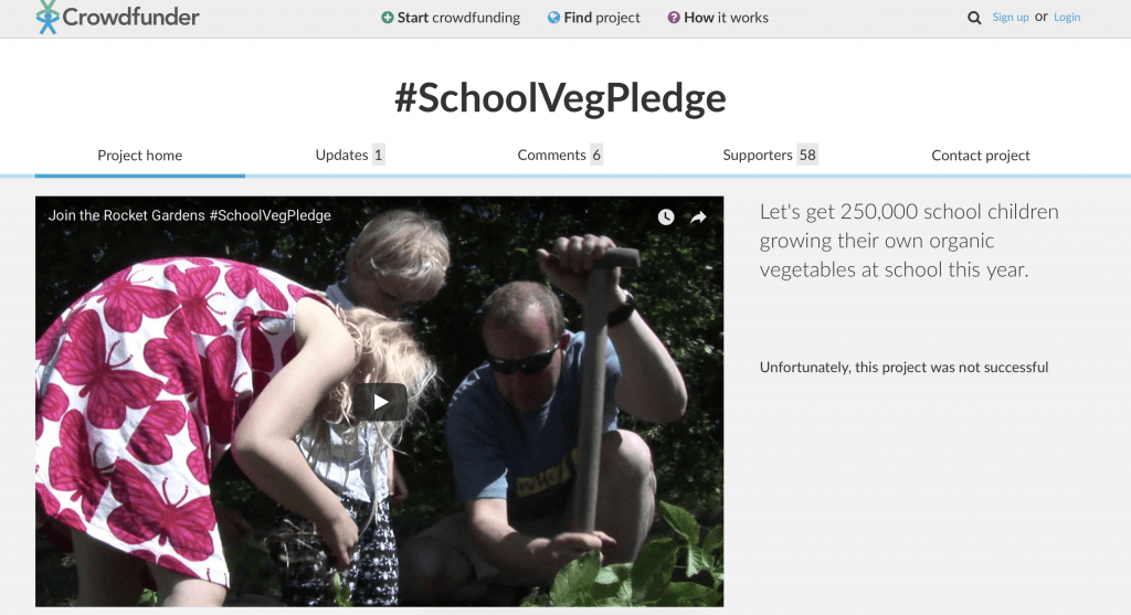
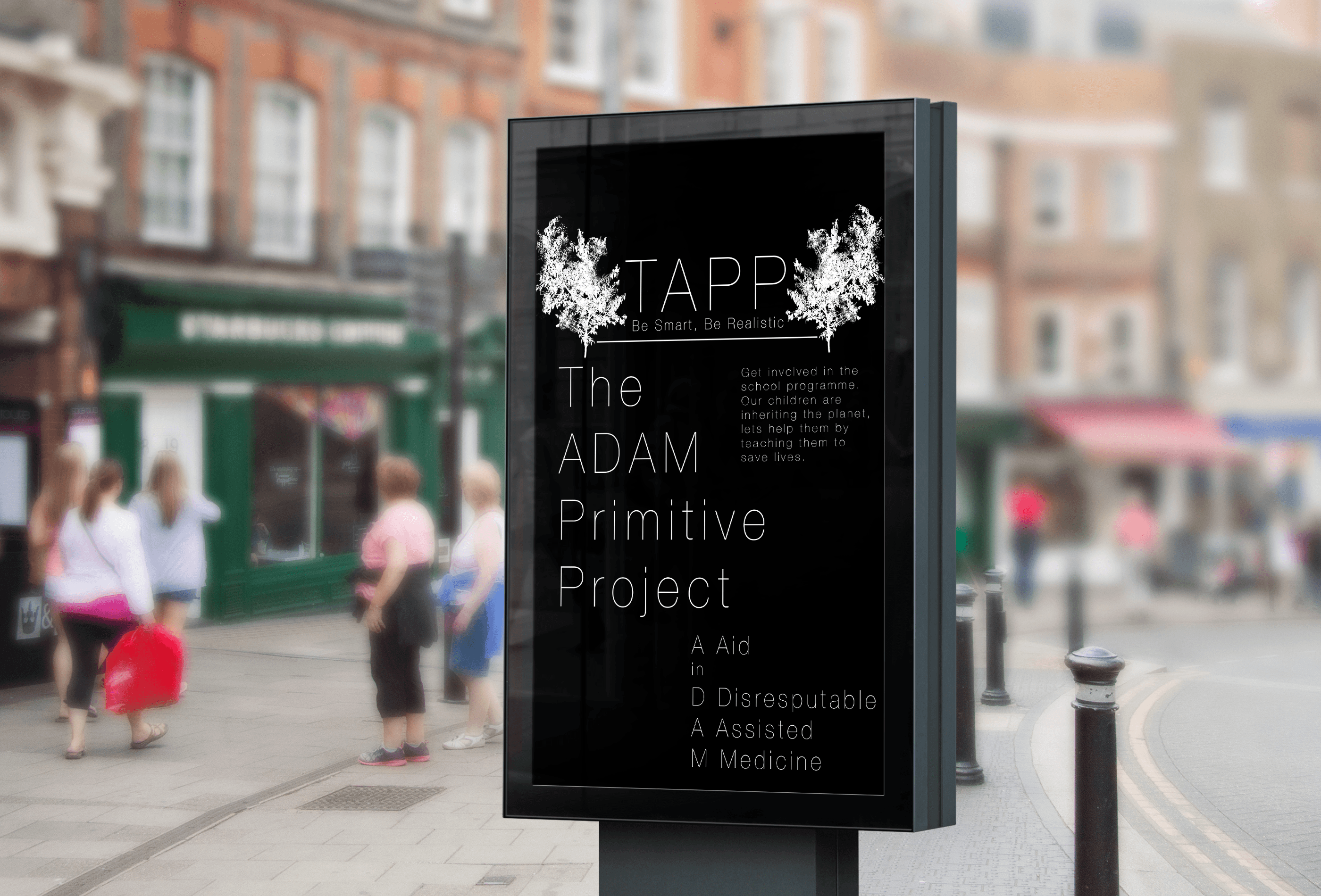
One, in particular, was called SchoolVegPledge on Crowdfunder. I chose to look at this because it was to do with a school programme. To begin with, it started with a visualisation and then proceed to a question and a description. The page is not very good looking, nor is it easy to navigate. However, there is a ton of important information and it looks to be well informed.

Screen Shot 2018-03-06 at 13.27.58 Screen Shot 2018-03-06 at 13.28.10

(This is all there was the page)

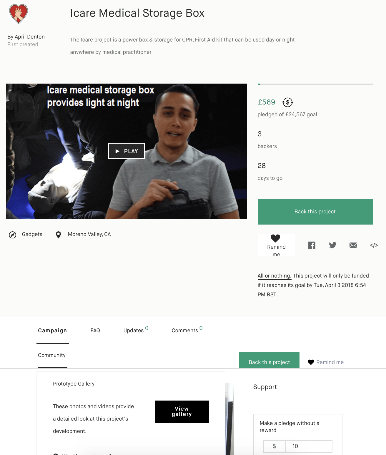
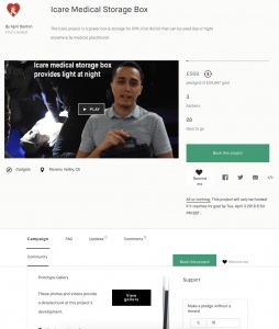
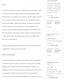
The two chosen from kick-starter, are completely different. The first one is by April Denton, this person has made an ‘Icare Medical Storage Box’. At the top of the page, it starts off with a video, in the video, you can see a young man holding some type of storage box, and in the background, there are people performing CPR on a dummy. This instantly tells me it is about some kind of medical/first aid product. Below the image, there is the name and a brief description of the product. In the about section, it is just a paragraph explaining the usage, what the project wishes to achieve and who it will be demonstrated too. They also mention the box will be donated to Red Cross, American Heart Association etc.

Then finally, they have conducted a risks and challenges paragraph to tell us what could go wrong or what the potential legalities are. Down the right side of the page, there is a list of things you will receive if you back the project. It tells the viewer how much they have pledged and what they will receive. In this case, ten US dollars (seven pounds) will get you an Icare First Aid Pouch and a thank you card, and ten thousand US dollars (seven thousand two hundred and twenty-six pounds) will get you six Icare Medical storage box kits and a thank you card. Overall, this page does not really have a lot of information, to me it is too short and I does not really tell you a lot of things about the product. I am the type of person who likes to read about stuff rather than watch a video of someone explaining it. That way I can read what I want how quick I want, if someone is speaking in a video, I am more likely to skip it, meaning I could miss something important. It relies heavily on the video to explain everything, which in a way, is not such a terrible thing, but it just looks unprofessional.

Screen Shot 2018-03-06 at 15.57.46


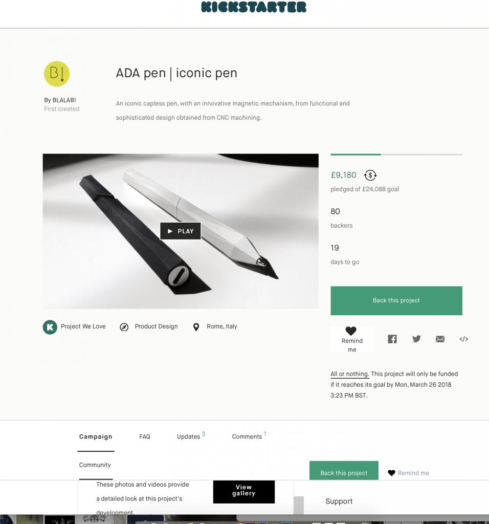
Last but not least, the ADA pen. This pen is made from aeronautical grade aluminium, their inspiration came from ‘nature’ as they state in their ‘Inspired Us’ section. This page is set up exactly the same as the previous kick-starter page, except it is way more elegant and simple to look at. It has lots of visual elements and little writing, maybe four or five lines per section, this is a bit more appealing. However, halfway down I got bored. It is too long and it seems to be a little bit repetitive. This funding page starts off with a video. Then the name and a brief description, under this, it has how much has been pledged out of its desired goal. The number of backers and how many days to go till it is finished. Under all this and a bit further down the page, they have uploaded a gallery to five the images. What I really liked about this project is have they included a drop box at the bottom of the page, in this dropbox they included all the high-resolution images. This I guess is so people can share their images to the best high quality possible.

There does seem to be a general structure law that everyone seems to stick to. This is as follows;

  • A header image or video
  • The name of the project
  • A summary
    • Money donated / money that needs to be donated
    • How many backers they need
    • Days left of fundraising
  • Promotional video or visuals
  • Why they are doing it
  • How will it work
  • The rewards
  • Risks and Challenges

Overall, this type of information is very useful when it comes to explaining how it works and what the benefits are.


https://www.kickstarter.com/projects/1436315259/icare-medical-storage-box?ref=nav_search&result=project&term=first%20aid

https://www.kickstarter.com/projects/849682762/ada-pen-iconic-pen?ref=section_design-tech_new_and_noteworthy

http://www.crowdfunder.co.uk/school-veg-pledge/

Concept Visualisation

Branding Design

Initial/Test Designs

This design was part of my original thinking, but after a bit of development, it just did not look good enough. It looked plain and boring and does not look thrilling enough to grab peoples attention.

Screen Shot 2018-03-05 at 13.26.43


Chosen Designs

These designs for the logo/project name have been adapted three ways to allow for different documentation types.

Logo redLogo bag


Logo bw


These designs for the stamp/shortened logo name have been adapted three ways to allow for different documentation types.

Logo stamp 6

Screen Shot 2018-03-06 at 16.57.21

Screen Shot 2018-03-06 at 16.57.32

 STYLE GUIDE

The style guide is a reference to all my style decisions, it contains all the visual elements that need to be in my lesson plan document/proposal.

STYLE GUIDE1

STYLE GUIDE2 STYLE GUIDE3 STYLE GUIDE4 STYLE GUIDE5

Project Visualisation

Project Name


3

tapp

In terms of creating a name for my project, I needed to consider the logistics. I am not creating an app or a game, therefore, the name really does not need to be catchy or trendy. Due to my final solution being a lesson plan, the name needs to be formal, as if it is an elegant but a formative company/trust. The name needed to be easy to remember and easy to pronounce, I wanted something that was short with an underlying meaning. I thought about using the name of someone close to me, because this would create meaning and it is quite often used. Just recently, the Prime Minister (Theresa May) named a new law after a young child named Max, naming it ‘Max’s Law’. This was after he created an organ campaign to save lots of peoples lives, including his own. This new law states that you are automatically enrolled in being an organ donor unless you opt out. (https://www.mirror.co.uk/news/politics/donor-law-called-maxs-law-11327971)

Moreover, I decided to call this project The ADAM Primitive Project. Below is a guide as to what ADAM means.

A – Auxilim (Aid) – Latin

[in]

D – Disreputable

A – Assisted

M – Medicine

The reason I chose the words, aid in disreputable assisted medicine, is in relation to some people not knowing first aid. Which in turn makes it disreputable and distrustful. It makes most things a lot more dangerous and it is a problem that can be solved by a new learning programme introduced into schools.

The ‘Primitive’ word relates to denoting the early states of something in development, I felt this was fitting because it matches the problem. This problem is in the process of being looked at but in an undeveloped and rough manner. As this word has two meaning, I felt it fitted rather nicely.

The word ‘Project’ is used at the end because it is not a product, it is a project. Something that would be proposed to the government or people who work in schools, it is something that could be developed after several case studies have been conducted.

The colours I had the choice of were; Yellow, Orange, Blue, Green or Red. Yellow and orange are not very nice colours, I find them unattractive and hard to use when trying to attract peoples attention. In terms of branding, I think they look very childlike. This would not work for the audience I am trying to reach. Blue is used too much and does not really attract the right attention. Green is used on everything; emergency escapes, first aid, no danger, some hospital uniforms etc. however, I did not want to use the conventional green colour in cooperated into my logo, although it is fitting, it still does not attract the right attention. It is eye catchy and it is insinuated in emergencies, the old-fashioned medical cross used to be red also.

Logo Design

I had to really negotiate with myself about what type of logo I needed to produce, I wanted to do something that is conventional but original. I experimented with several ideas, but I ended up going for a more simplistic approach. Below are a few drawings I did before I mocked up a few examples. 1


Logo stamp 1 Logo stamp 2

As you can see, I am not very good at utilising hard drawn logos. I do not feel like this is where my creativity lies.

Logo stamp 3 Logo stamp 4

These two I really like because they are simple and elegant, however, I really feel like it needs some sort or words. Not to mention, it does look like some logos that are already out there.


Logo stamp 5


This one is good, but it is not really interesting enough for me to apply to all my documents.

Logo stamp 6


This last logo is my favourite. it is hard to read at first but I think it would work as a little water stamp or a logo print etc. I think is the final logo I will have as part of my finished piece.

Lesson Plan Thumbnails

I have drawn up some lesson plan thumbnails, this is a rough guide as to how I want my lesson plan to play out. The final product will be attached to my crowdfunding page.

thumbs

Final Concept Solution

Final Solution

To paraphrase my last post, I am conducting a twelve-week programme which will consist of twelve, first aid training procedures. these procedures will be beneficial to their lives and the lives around them. Within this twelve-week programme project, I will incorporate; Digital imaging (interactive images and videos), Virtual Reality, and the physical inclusion of dummies etc. These will all be conducted in a two-hour workshop.

My next task is to design a name, a logo, a style sheet, an example of the lesson plan and anything else that will be included in the branding and visualisation.

Branding and Visualisation

Before I consider any type of branding, I need to establish what programmes I am going to use and where I am going to source all the images from. Moreover, I also need to certify a colour scheme to which my whole project will revolve around.

Colour;

The colours I could use are Yellow, Orange, Blue, Green or Red. These are all the colours associated with medical care/emergency care. I like the idea of using a dark grey colour on the documents because this makes it look professional and grey is a quite a neutral colour, it contrasts well with pretty much every other colour out there and it almost looks sophisticated. No matter what, I will create designs that can be used for different document types. For example, a greyscale logo, a black and white one and a normal coloured one.

Programmes;

The programmes I intend to use will create all my visual elements, I plan to use Adobe Dimension to create some 3D branding on some products, advertisement stands etc. I will use Adobe Photoshop and Adobe Illustrator to create the logos and stamps. Using photoshop, I could create some reward T-shirts or bears etc. Photoshop will be my backup resort for all the branding issues that go wrong, I am familiar with photoshop and I do prefer to use it, compared to anything else. “Do what you know.”

Images;

Allowing I have left myself enough time, I could go out and source some images from my own camera. However, if this fails because I have not allocated myself enough time to produce them, I will use Adobe stock and purchase some images that allow you to do a swap with their ‘smart object’ layers. I plan to have at least four or five different images to create advertisements on.

__________________________

In terms of the Lesson Plan document, the colours will follow on from what I produce for my logos and any other necessary documentation/images I need will come from the stuff I produce at a later date.