Critical Evaluation

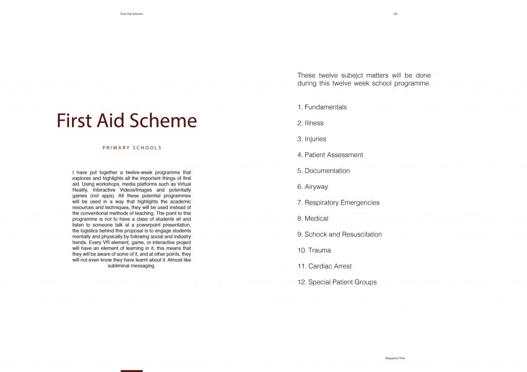
The problem I decided to raise and base my project around is first aid, the aim of this project is to introduce first aid into schools. This problem’s solution got named TAPP, TAPP is a project that is focused on tackling sought after First Aid. The aim of this project is to introduce First Aid teaching into Primary schools. Using a twelve-week programme, this ‘Lesson Plan’ will explore and highlight all the important things that are involved in First Aid. The logistics of this Lesson Plan are to engage the students in a new form of teaching mentally and physically, using social and industry trends. These Trends are Virtual Reality, Interactive Videos/Images and Games.

The concept behind TAPP’s proposal / lesson plan is to attract the attention of staff members that are in the position of power in schools, it is also there to be presented to governing bodies to see if they can change the law, so school children can learn First Aid alongside their studies, just as like PE is a mandatory subject. TAPP, in terms of branding, is clean and elegant and it does well in displaying a professional feel to it. The only thing that does not work, is the leaves on either side of the name logo. With further time, this could have been developed, and something could have been made to make it more recognisable in terms of it being about first aid. The research fails to identify any other proposals that are similar, not identical, but similar in its approach. However, the research provided gives a good clear example as to why First Aid needs to be introduced. Using facts given by people who have surveyed children, helps shapes what the context is without have to contextualise it. I think this project would have been better if there was some video content attached instead of just visual mock-ups, this way there could have been a lazy option in explaining things. Most people like to watch a video, rather than read an article. Next time, I will need to conclude this in my primary research and conduct a question that asks which they prefer.

This brief that was assigned told us we needed to propose, research and communicate a digital media concept to help people in the real world. I feel this project does this to its best ability, by using both methods of research (primary and secondary) this project is well informed, however, I am not too sure whether it communicates a good understanding of the project in full. The branding and ideas are well developed and nice to look at, but it is not all about the visualisation. More programmes from the Adobe suite could have been utilised more, instead, Photoshop was taken advantage off throughout the process.

To allow for a solution, it is vital that research is conducted to its full potential. There is always something out there that will have a line of information that follows it, along with a bunch of visual elements that are necessary to the issue, whether this is to prove a problem or to elaborate on a problem, it should all be researched, purposed and communicated to its best.
Personal Reflection

As soon as we were tasked this project at the end of last semester, I was really unsure as to what to do. It was not so much the task, but the idea behind it. There were so many problems with the world, it was hard to pick one. I originally had an idea for Go Green – Plastic, but I just did not know where to start with it. Eventually, I came up with the idea to include some type of child first aid, because not many new parents know what to do when it comes to their child being hurt or injured. I was again, unsure as where to start with this project. I did a research analysis questionnaire on some strangers and the results I received were so broad and different to what I imagined, I did not know where to start. The problem just revealed itself to be really broad and to be able to secure a viable solution seemed like a distant dream.


Conducting lesson plans and creating crowdfunding pages, is where my knowledge base stops almost. I could have produced an app or a video, as these are areas in which I feel most comfortable in. However, I wanted to experiment and see if I could create something that is going to make a real difference, not another app that will never get used or developed because there are too many. I am not familiar in the world of first aid or anything medical, therefore, I decided to focus my research solely on medical charities and what they do. I feel, the research side of my blog was a success. I got some really good results in terms of my primary research and I got to speak to an actual practitioner, who really gave me some insight into what she thinks would be a good idea when it comes to teaching the children in primary schools. In week two and three, when I produced the research plan, I know for a fact I did not stick to it coherently. As I progressed in the subject and the research, my ideas changed, and my problems changed. The more I researched the more I found people had already solved or were trying to solve the problem. The real challenges that I faced was keeping up with the work load, if I missed one day due to illness etc. it would be really hard to catch up and several times I would fall behind. Pushing myself to actually research things were really hard because it is such a long and painful process.


I feel the colour scheme works really well, I know in some areas I have not stuck to it one hundred percent, but it still works and still looks just as effective.


Moreover, the one thing I am really happy and pleased with, is my crowdfunding page. I feel it looks really professional and explains my project well, it is easy to read and is elegant in design, approach and content. Overall, my project management needs work, especially for this part of the module. When I feel behind it really took a toll on the work load. Furthermore, I will end on a positive, I think the look and project development as a whole is successful and I learned a lot from the research, the people I spoke to and I now know quite a bit about first aid. Finally, I learned from various aspects in the design process.

Crowdfunding Layout

Pitch

gjug

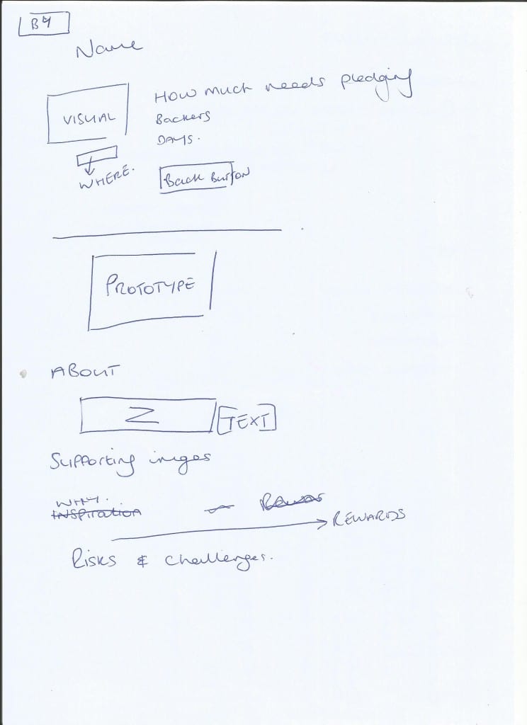
The following steps are a brief layout of how I want my crowdfunding page to be laid out.

1. Name (TAPP)

This will be the Name of the project (the logo) – This insinuates professionalism and elegance.

2. A supporting Visual

This can be anything from the advertising mockups.

3. Where it is based

4. How much needs pledging

5. Current backers

6. Days left till it ends

7. ‘Back this project’ button

8. Prototype

This will be the lesson plan, a PDF format that allows views to have a quick read, just like the previews on Amazon Books.

9. About

This will be a small paragraph that defines what the project is and what the aims, and why it is important to do this project.

10. Supporting images

I will apply some images of the prototype so people do not have to keep clicking back and forth, they will illustrate what it is.

11. Why I am doing the project

A brief paragraph on why this project is important to me and why it could prove effective.

12. Rewards

A short and illustrated paragraph on why people should invest in the project and what they will get as a reward. I will add the images for them to view.

13. Risks and Challenges

This will explain the legalities and it will explain it is a possibility I will not get the full amount of funding. General logistical information.